Neville Brody - Research Paper
I have written about Neville Brody for my Research Paper assignment. I would love to hear what you think of it! :-)
 Neville Brody
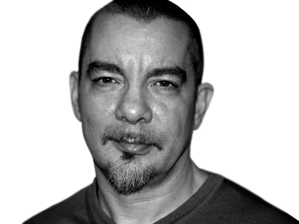
Neville Brody was born on the 23rd of April, 1957, in London, England. Passionate in artistry, Brody pursues a successful career in graphic design, typography, and art.
In 1975, he studied painting at Hornsey College and then continued at the London College of Printing from 1976 to 1979. Some of his works could be seen on ‘The Face’ magazine (1981 - 1986), ‘City Limits’ magazine (1983 - 1987), and ‘Arena’ magazine (1987 - 1990). In addition, Brody held a position as an artistic manager for ‘Per Lui’ and ‘Lei’ magazines of the Condé Nast Publications in Milan and for ‘Actuel’, a French magazine. In 1988, Brody released the first of his two monographs on graphic design titled ‘The Graphic Language of Neville Brody’, which then turned out to be the world’s best-seller. Total sales currently amount to over 120,000. A collaborative expo of his works held at the Victoria and Albert Museum drew the attention of more than 40,000 sightseers prior to moving on to Europe and Japan. Also in that year, Brody served such clients as Nike, Premiere TV, ORF, the House of World Culture in Berlin, the Deutsches Theater in Hamburg, Parco department store in Tokyo, and many others. He considerably contributed to the establishment of FontFont (now known as FontShop) in London and created several illustrious typefaces for them. Besides, Brody took the onus for initiating the award-winning FUSE scheme - a significant union involving a magazine, graphic design and typeface design.
As a graphic designer, Brody currently works on a series of projects including packaging for Kenzo Perfumes and building brand names for corporations, for example Macromedia and HomeChoice. His Research Studios, which were opened by Brody and his business partner - Fwa Richards - in 1994, scatter in the world’s famous metropolises, such as London, Paris, and Berlin.
Most of Brody’s works are designedly vague. He describes his style as ‘a catalyst for thought and for questioning’. He says, ‘A lot of our work is an open-ended statement which often is not completed until the person who looks at it has reached his or her own conclusion’.
The artistic factors of Brody’s typographical approach show Art Deco influence and his style works against non-European impact. Today, his design perspective has formed a worldwide model for the new era in the history of computer-generated design. Brody played at the margins of visual language and employed it to create a new age in typeface design. ‘Digital design is like painting, except the paint never dries. It is like a clay sculpture that is always being twisted into new shapes without ever being fired.’, he concludes.
Magazine advertisement for Nike (1988)
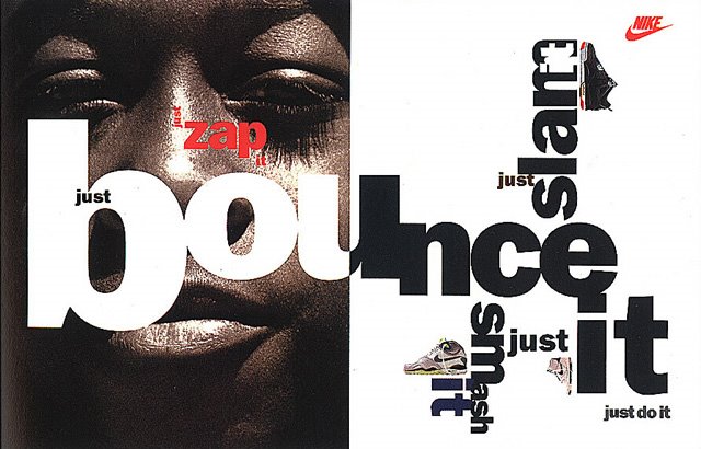
This piece was designed for Nike in 1988, which faithfully mirrors Brody’s powers of using design elements and structure, especially typography. It is kind of interesting to arrange the text in such a way that it floats all over the place, yet is still ‘readable’. Brody divides this piece neatly into two parts, one of which is an image and some text on it and the other is filled with types. Combined these strike an asymmetrical balance between a large image and several small graphics, which can bring about a dynamic emotional reaction. Five ‘justs’ plus a stunning close-up of a colored basketball player’s face inspire a sense of insecurity and desire.
It could be said that Brody’s use of whitespace is quite intelligent. His choice of font and his use of colors interact tremendously well with the background since there is a stark color contrast - black and white - in appearance, which creates intense excitement. The whole piece looks relatively simple, clear, yet impressive.
Poster for Graphic Arts Message (1992)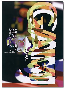 Compared with the above magazine advertisement for Nike, this piece looks different in the way Brody uses typography. It is quite hard to recognize what the text is all about at the first glance. In fact, this text is comprised of three letters G, A, and M, which stand for ‘Graphic Arts Message’. By creating three different layers for three sets of letters and using colors (white, green and orange), he somehow creates a sense of ambiguity. On the other hand, his use of typography in this design is pretty extraordinary. Brody uses a black background with some blurry areas in it in order to emphasize the use of typography. It is not hard to notice that the way he arranges text in the majority of his designs is pretty the same. For example, in the previous advertisement and in this poster, Brody places the text in many directions and angles, which gives the audience an overall view of his design. That way of arrangement really plays an important role in creating positive effects on the viewers since it is likely that the observers will have certain whitespace to please their eyes. The text also gets a harmonious interaction with the background. Furthermore, ‘Graphic Arts Message’, ‘92’ and ‘TOKYO’ are organized very cleverly to evoke an asymmetrical balance in his design. Since the abbreviation ‘GAM’ causes the audience to read from top to bottom, it is really clever to set other smaller text ‘Graphic Arts Message’ and ‘TOKYO’ in the opposite direction. Brody also places the year ‘92’ in a nice position so that people could know the year in which the event was held. Since much of space is allocated to ‘GAM’, he has to save space by reducing the size of other text, yet it still conveys the meaning he intends to. Therefore, Brody reduces ‘1992’ to ‘92’.
Logo for FontFont (1990)
Actually, this design has interested me very much since the beginning, as it discloses the balance of using typography for the background, color, and font. In the background, the viewers can see clearly the FONT letters in both black and white models. Surely, it has a strong opposite of using the text up-side-down and gets balanced itself. Moreover, the colors of back and white can modify the equity in his design so one sinks into the dark black and red colors, and the other gets attention from the viewers at the same time. Indeed, the background by itself can show how nicely balanced each of his design has. It is the combination of both black and red letters mixing together into one form.
On the right side, the viewers will be amazed by his style of design. Unfortunately, this picture size is not large enough to give the viewers an overall insight of its meanings. By looking at the very first picture amongst the three, we could have a sense of how the text paragraphs work with the alternating background color. In most cases, the white text will always be clear when it goes with the black background. However, in this context, the black word was purposely mixed with the red background in order to make it quite impressive and interesting for the viewers.
The way he connects some angle shapes with the text paragraphs has engaged the audience in admiring his work. His ultimate purpose is to create a fine structure. In addition, his use of whitespace seems quite generous.
Throughout the three above specific designs, each of them illustrates some fascinating points about Brody’s use of typography. In the first design, Brody arranges the text in an interesting way which seems ambiguous to the audience yet readable. Moreover, the viewers can also catch the point of how to emphasize a text and organize it in a logic way. Fortunately, the logo for FontFont creates a right feeling of his typography art as an attractive curve in the design field. In short, Brody is so clear-cut and creative not only in organizing the text to be compatible with the background, but also to help it convey the logic, balance, agreement and opposite together. In general, his style reflects in his use of balance, logic, harmony, typography, and a creative mind. Those approaches always appear in his design particularly and in each successful typography design generally.
Sources:
Gibson, B. 2006, ‘Inventing a Graphic Language’, Apple Computer, Inc., viewed on 19 March 2006, http://www.apple.com/pro/design/brody
Knowles, J. 2006, Brody’s portrait, Research Studios, viewed on 21 March 2006, http://www.researchstudios.com/home/006-neville-brody/Neville-portraits/HIGH-NB-JK-002.jpg
Linotype GmbH, 2006, ‘Neville Brody’, Linotype.com, viewed on 19 March 2006, http://www.linotype.com/7-669-7/nevillebrody.html
Research Studios, 2006, ‘Biography’, Researchstudios.com, viewed on 20 March 2006, http://www.researchstudios.com/home/006-neville-brody/NEVILLE_home.php
SandOll Communication Inc., 2006, 3 images of Brody’s works, SandOll.co.kr, viewed on 23 March 2006, http://www.sandoll.co.kr/renew/mm004_read.asp?idx=497&parentidx=497&category=66&returnOffset=&maxrows=
Wikipedia, 2006, ‘Neville Brody’, Wikipedia.org, 6 March 2006, http://en.wikipedia.org/wiki/Neville_Brody
posted by Hang Tran @ 5:22 PM
![]()
![]()


2 Comments:
Nice piece.
> He considerably contributed to the establishment of FontFont (now known as FontShop)
Actually, FontShop is the name of the company, a font reseller. FontFont is the label for their foundry or house collection of fonts.
I have been looking for sites like this for a long time. Thank you! Sex gallery comics Wheel chair ramps into showers jewel denyle interracial
Post a Comment
<< Home