Thursday, March 09, 2006
Palace Classic Films
http://www.moderntimes.com/palace/
Great website of Hollywood's Golden era, and the fabulous Classic Films. Hundreds of images, many audio clips, a comprehensive bibliography, engaging and informative articles on movies and filmmaking, links to many of the best classic film sites on the WWW...I really like this site and I'm sure you're gonna love it if you're a proper fan of its kind.
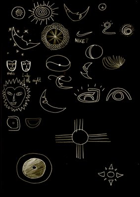
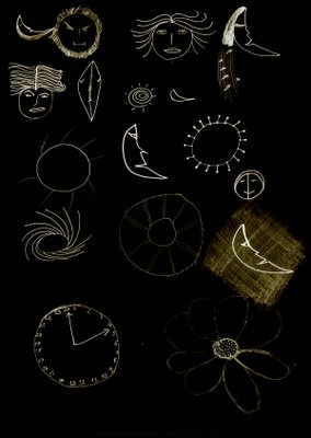
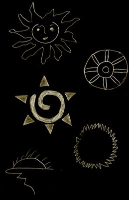
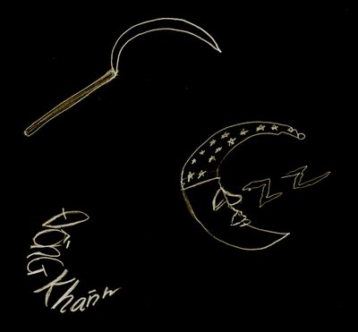
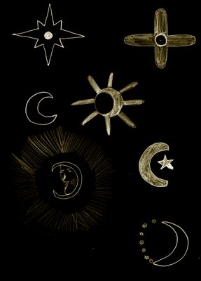
Sun and Moon symbols
These are Sun and Moon symbols which I have sketched out on papers. I have used Photoshop to make some adjustments so that they look more presentable.Hmmm...you could see that I have a whole bunch of messy stuff there...haven't figured out the best way to present a sun and moon symbol. I really really need some comments and suggestions. Please!!!
Wednesday, March 08, 2006
Too powerful to resist!
Here comes another collection of Flash sites. Trust me, you gotta be stunned by these brilliant websites.
You could also visit my old blog to view some other Flash sites which I have put together. Click here!
------oOo------
Leo Burnett Canada was not satisfied with the status quo. They wanted a website with no limitations, a website that would reflect their very original and very inventive company. So check it out, and let them know what you think of their site. (Be sure to click on the apples.)
http://leoburnett.ca/
If anything, this week's site of the week deserves to be noticed just because its creator, Dave Werner, spent so much time putting it together - which will become immediately obvious when you view the site. Okaydave.com is Dave Werner's personal portfolio, and in my opinion, it's everything a portfolio should be. Not only does this site showcase Dave's work, but it also has a personality of its own. This website showcases a WHO, not just a WHAT!
http://okaydave.com/
Just when it seems that all creative ideas for the internet have been depleted, a site like Kamikadze comes along and restores my faith in web design. The design and navigation of the site revolves around a very simple idea, but it's done very effectively and creatively. Check it out.
http://www.kamikadze.sk/flash.html
Who would have thought that a website about water could be so vibrant and interesting? The creators of the Glaceau website did a great job of communicating their idea of "a fresh new approach to water". This entertaining website is a great example of how your site design can (and should) effectively represent the values and ideals of your product.
http://www.glaceau.com/
Astounding, invigorating, and galactically delicious! I stumbled across what has potentially become The Best Website Ever Created in the History of the Known Universe and its Surrounding Celestial Entities! I hope I haven't overstated the profound enormity of my aforementioned discovery, but it cannot be stressed enough that this website is--if I may borrow a phrase from a noted philosopher--"flippin sweet"! Words fail me . . . Just go!
Stephane Guillot is a very talented web designer and illustrator from France. (Don't worry, the website has an English version as well.) This site is very cartoonish in nature and is very well put together. The animations are very ingenuitive and very entertaining.
http://www.stephaneguillot.com/
ABSTRACT GRUNGE
Hehe...I suddenly felt like making some abstract/grunge backgrounds. So, here they are!
I have followed the instructions in the document titled 'Abstract Grunge - Photo Montage' (you could find it on Black Board, under Course Documents/Week 2 folder) to create this picture. Well, it didn't look good at first; therefore, I had to play with layer options like layer styles, opacity settings, and layer modes until I got the effects I wanted. It's not bad, is it?
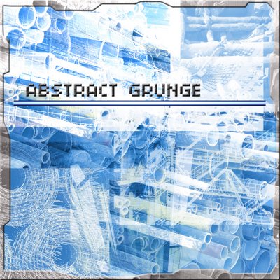
To create this image, I have used a couple of Photoshop's filters (such as Lens Type, Chrome, and Wave), adjusted the Hue/Saturation settings to color it, and experimented with some different layer modes (like Lighten, Overlay...).
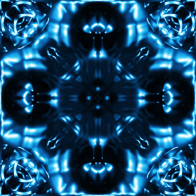
Again, I used Clouds, Wave, Chrome, and Pinch filters (filters in Photoshop are very powerful, huh?). I also adjusted the layer modes to get the effects like this.
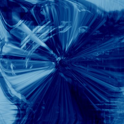
Radial Blur, Mezzotint, Ripple, Twirl filters were used. In addition, I have utilized Gradient tool to get a sense of disorder. That's it! Have fun ;-)
